
Wednesday, June 18, 2014
Tuesday, June 3, 2014
Photo Essay - Baller's Life
Step Up

The life of a baller starts of here. This is a court where every baller will need to step in, to become who they want to be. The court awaits for the players to step in and take the challenge that is before there eyes.
Challenge Accepted

We are given the gear to play the game. Are the baller's going to pick it up and challenge each other to see who reigns supreme on the court.
Let's Play

Here we have the ball player's stepping up and taking on the challenge. They have all played well and to there fullest ability but there can only be one true champion.
Hard Life

This is where the people who couldn't make it have to seat. They had there dream crushed by the best player and they have no hope of ever getting back. They no they are not the best but they will try and try till they bleed. This is the dedications you get when they love to play the sport.
Supreme

Here we have the the king of the court taking the winning shot. As he took the shot a lot of things have been on his mind but he felt amazing as the ball leaves his palms, straight to the basket. It was a hard battle that he had went trough but in his mind it was worth while. He had made great memories with all the people around him.
Wednesday, May 21, 2014
Trucking and Dollying

Truck : Same as Dolly. The only difference is that you move left or right instead of forward or backward. It's somewhat similar to Panning but for Panning the camera remains firmly as on its axis.

Dolly : Dolly is a kind of camera movement that is somewhat similar to Panning but the difference is the same as Truck/Tracking shot, meaning instead of being stationary you actually move with the object but the difference this time is that you move towards or backwards the object.
Monday, May 12, 2014
Compositional Elements in Photography
Camera Angle {Low}

I believe that this is a great example for the compositional tool "low camera angle" because this photo was taken from the ground while looking up. I like this picture because of the glare of the sun, I think it makes something special.
Leading Line

This is a good example of leading line because the line directs you into a single focus, which is the bottle. Out of the 5 this is my favourite picture so far because just by editing it a bit it turned out to be really good looking picture.
Rule Of Thirds

This is a good example for the compositional tool rule of thirds because where the point intersect, thats where an important piece of the picture is. The point intersect at that random guys face.
Movement/Direction

I believe that this is a good example for movement/direction because the cars are only moving one way and that is to the left.I think it that the photo would have been better if the cars where actually moving.
Simplicity

This is a great example of simplicity because i believe that this photo was taken in a simply way. All I did was went to the side of the hallway and then tilt my camera a bit and click the button.
Wednesday, April 16, 2014
COMPOSITION IN PHOTOGRAPHY - Shape

This is a great of example of shape because this people created one big shape just by combining 5 shapes together. This caught my eye because the idea is so simple that anyone can tell what the photo is trying to show.
COMPOSITION IN PHOTOGRAPHY - Rule Of Thirds

I believe that this photo is a great example of rule of thirds because the main focus of the photo is at the point where two lines intersect and it also uses 1/3 of the photo. I thought this photo is interesting because of how they used the rule of third and how the photo was taken.
COMPOSITION IN PHOTOGRAPHY - Motion Blur

This photo is such a good of example of motion blur because it shows two rapidly moving animals in a still image. They are moving so fast that it shows their past body images. This instantly caught my attention because i thought it was a funny photo.
COMPOSITION IN PHOTOGRAPHY - Breaking The Pattern

I choose this photo to be an example of breaking the pattern because it's such a great photo and it simple shows the meaning of breaking the pattern. This photo caught my eye instantly because of how simple it is but shows so much meaning.
COMPOSITION IN PHOTOGRAPHY - Timing/Decisive Moment

This is a good example of decisive moment because it catches all the soldiers up in the air at the same time. When I saw this photo it caught my attention right away because i thought about how skillful the photographer must be to catch such as an amazing photo.
Friday, March 28, 2014
Spring Sensations


To create this poster I looked for inspirations on the internet but could not find any that peaked my interest. Since no posters interested me so, i looked for images that is in the spring category. Thats when i found this beautiful three that I am using now. I noticed that the tree had a water colour style so, I went back on the internet and searched for any backgrounds that had the same style. I was scrolling through then i found one that had a nice colour and that matched the theme spring.
After I was done getting the pictures that i needed I opened up photoshop and opened a new document with the dimension of 8.5 by 11 inches. After that i opened up the tree image. The image had a white background so i had to use to magic tool to render out the white background. After that I re-sized the tree. I tried every position for the tree but I liked them all but then I remembered that the text also needed a place. I thought of it being small and in the corner. After I placed the tree, I opened up the water colour background and re-sized it to 8.5 by 11 to fit the original dimensions. After i placed the background I thought that the grass fell short so I copied a part of the grass and placed it besides each other. I carefully placed them to make it look like it was natural and right.
After the images were carefully placed I started thinking of place i could put text. So, I went on the internet and look at some musical images then I found a photo that had the note tree. Thats were I based my text on. Spring sensation being on top because it is the most important text in the poster. Then at the bottom I placed the meaning of spring sensations. Then the location, date and time. After that I placed the ticket prices.
The difficult part of making this poster was trying to find the right place to put the text.
The ticket was very easy to make. The teacher told us to make the poster and the tickets to connect so, I just took the original tree and placed it on the ticket. Then I also copied parts of the grass to fill the bottom of the ticket. After that I made the whole thing black and white. Then i placed the text that needed to appear on the tickets.
Wednesday, March 5, 2014
Post #3
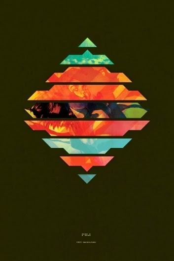
The black backgrounds makes the diamond in the middle stand out. Having the black background makes the other color have an easier way of fitting in. The color scheme is a good choice because the blue and orange complement each other.
P.S The background is actually black and not green.
Post #2

This poster show contrast and the use of space. The shadows and the colors changed from light to dark. The letters are not clearly visible because it small in the corner. The use of space is hard to tell because this poster is to abstract.
Post #1

This poster shows value it it gradually changes it's colors. The circle in the middle of the poster makes the title stand out. The color scheme of the poster gradually changes from light to dark. The purple gradually changes. It gets lighter and lighter until it hits the opposite color yellow.
Thursday, February 27, 2014
Post Card

I used PNG because it can display millions of colors. Images that are saved on this format will not degrade in quality, even when the file is compress. That means that there is no image data loss when saving or veiwing the image. It also supports transparency. For more information please visit Here.
My goal was to involve anime related items in this post card. I thought of that because i loved to watch anime. The background picture was matrix code falling down. I was always of a fan of the matrix code.I also added another background which was the Chinese words.
The steps I took to create this post card was a long one. First i look for anime images that i liked in the internet to put in my post card. When i found them i started placing them one by one. Then I opened up photoshop and created the dimensions which was 1800 by 1600.Then I took the enma and tsuna.png and re-size it and placed it on the edge of the postcard. After that I took the matrix background and re-size it to 1800 by 1600 to fit the dimensions. After that i also took the other background and placed it but i dislike it because there was a guy standing in the middle of that background so, I cut up parts of the picture and copied and pasted it. I cut it up three times and placed them beside each other. After that i also masked the background picture to make it look like they all fit together. After that I placed the smokes and other details and put up the finishing touches. When the pictures were placed, I added the title which was "Welcome To The Unknown." Once i was done I saved it and finished.
Subscribe to:
Posts (Atom)